Personal site as an App
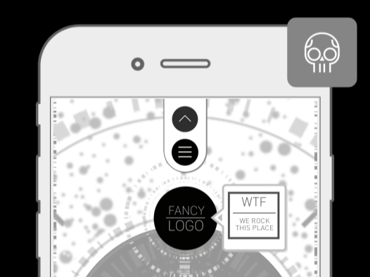
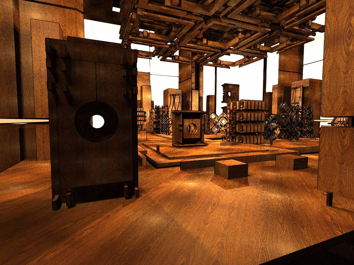
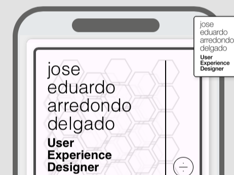
This portfolio site started as a HTML5 UX Experiment and looks promissing at the begining, but after few iterations we realize it didn't cover all corners.
A Simple Game
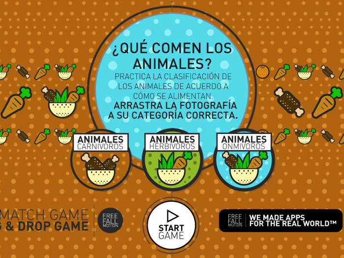
Last year working on the posible uses of Hype for Mac, created this game based on basic interactions, and really liked it, its simple and somehow it do the job, play and see.

The Fancy App
In my time as interactive designer, overflown screens with elements in motion (early to late 2000s) was the way to attract audiences, with fancy Flash sites and barroque designs.
