best free site builder
Mobirise

Card Manufacturing Toolset

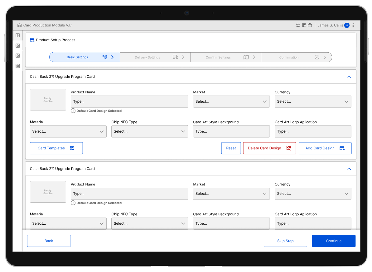
For this large financial institution, the card replacement process is a critical component of daily operations. Ensuring that every step of the card manufacturing process is executed properly requires the best set of tools. When it was time to enhance this toolkit to meet the current needs of the brand and the market, we collaborated with the Issuance Team to develop the right tools for each specific aspect of their work.

Our goal was to provide users with the right amount of data, in the correct sequence, enabling them to effectively create and update the current product line without any issues from day one.

Client and Location

Global Finance Instituion,
Phoenix, AZ
Jan 2020 to Apr 2023
Mobirise
Mobirise
Mobirise
Mobirise
Mobirise

Summary

What was delivered and how

Mobirise

— Services

Competitive analysis
User-interface design
Wireframing
Designing for Desktop
Developer collaboration

Mobirise

— Deliverables

Team Wide collaborative effort
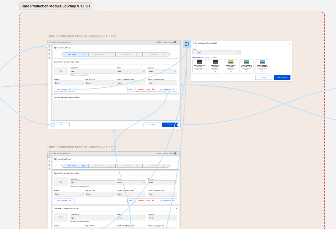
A fully-detailed journey map
Wireframes
User-interface designs
High-fidelity prototype

Mobirise

— Outcomes

Working hand by hand with all parties involved we delivered a polished prototype, a detailed, full scope prototype that can be used as reference for development and leadership approval.

Understanding the problem

A deep understanding of the problem was the first step

Improve service with better tools

Card Issuance is big part of their operation and to be able to handle all aspects of the manufacturing process and keep the leadership informed and ready to fix any potential issue as they took place was very important for the manufacturing team.


Opportunity

The myriad of different aspect of the manufacturing process was handled by several not connected tools, so the lack of consistency on the approach on each of them was a challenge. Visual Integration and Consistency was a true need and the ease of use to avoid expensive retraining was also on the table, so create a intuitive set of tools was a must and essential to properly address the major pain points.


Challenge

The biggest challenge was to make the different interfaces very intuitive and informative so the user were able to understand every single aspect of the process clearly, to avoid expensive card manufacturing errors that in the end will impact the perception of the customers of the brand that rely on replacement cards done right the first time. Thru several iterations and testing phases we were able to deliver a tool easy to use but full featured to avoid expensive retraining while keeping what was needed to get the job done.

The Approach

We worked hand by hand with the POs, Developers and End User to clearly understand their needs with the current set of tools, thru several iterations, we were able to deliver and refine several prototypes that allow us to gain knowledge on their daily job, since the tools has different scopes and access levels, we have also to document properly on the prototypes all roles needed for this tool.

...His work is outstanding, and passion for excellence is inspiring!...

Mariya K.

Sr. Technical Program Manager, Release Train Engineer

Takeaways

An iterative and lean design approach

Map, simplify, and repeat

Working with the Card Issuance team and learn about their challenges was an amazing experience, this tool impact some of the core needs of the business, the card replacement and issuance and its needed almost everyday to help the brand customers to be able to make payments in a myriad of business all over the world, so the impact to the user base and the brand is huge.

Working with Limitations

Work hand by hand with some of the most experience industry experts give us the insights of one of the most dynamic industries that is working hard to remain relevant in a world were the Fintech startups are starting to get closer to this Financial Institution model and customers, so helping the issuance team means also help a whole world of customers that need their cards delivered on time to keep the business flowing.

Wireframes

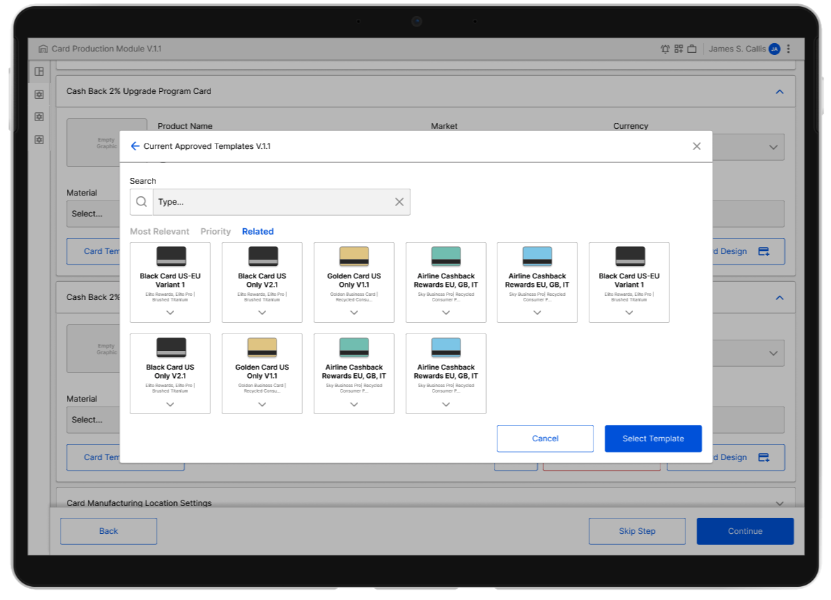
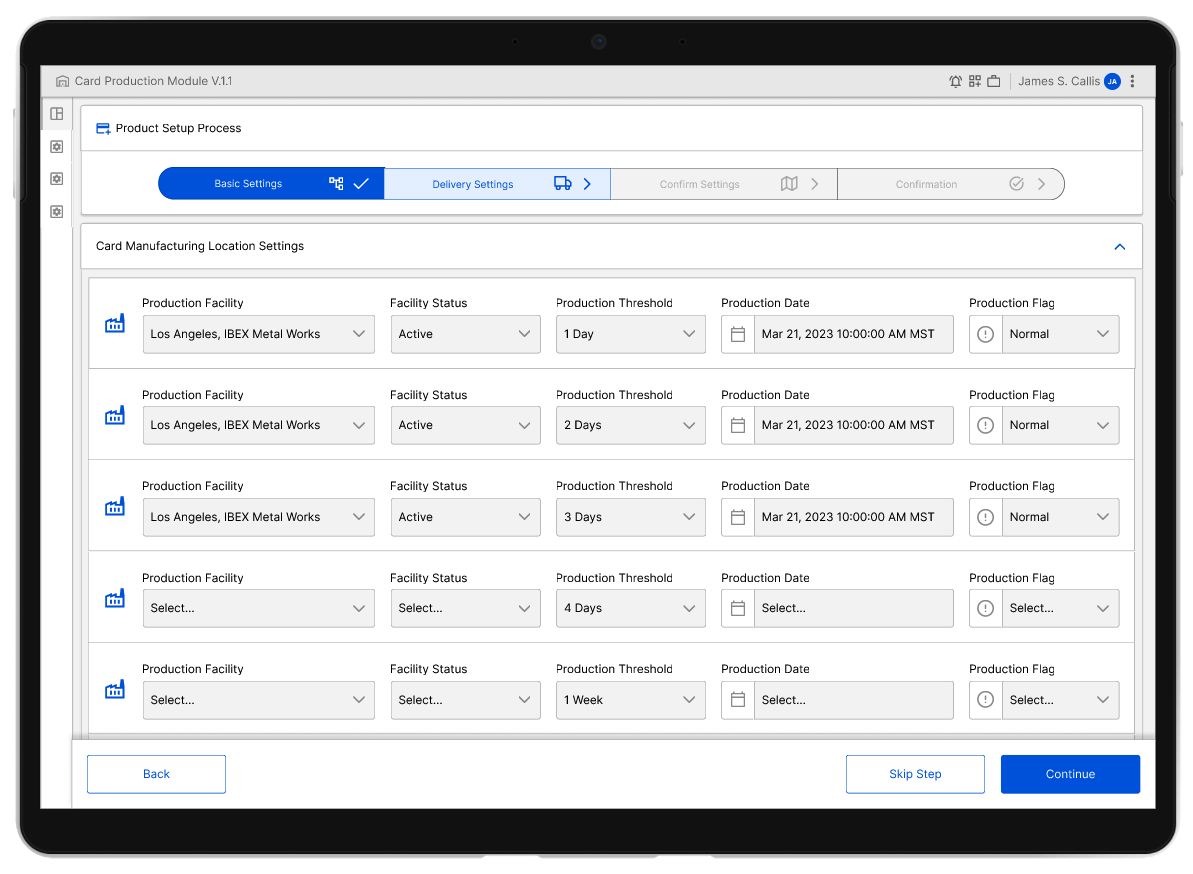
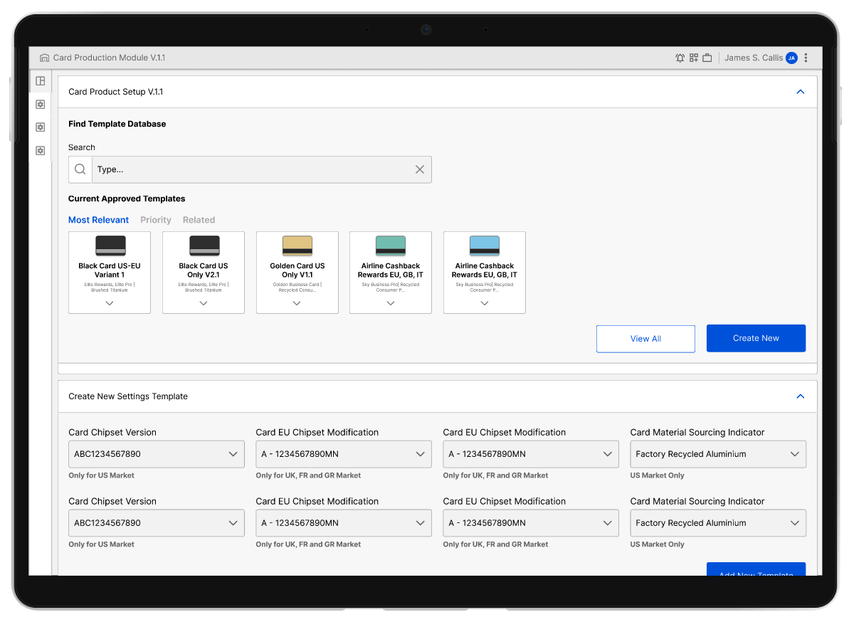
When a process of this complexity needs to be translated to the context of an application, is essential to be able to creatively define a visual language that in a compact space, allow the user to get the information they need to act fast but precise to clearly understand and diagnose any potential issue.


THE DESIGN
SYSTEMS DNA:
Building with intent

Every layer, component, and guideline within our Figma files echoes a unified design philosophy: Clarity today paves the way for innovation tomorrow. With our structured and informed approach, we aim to empower the Client design  teams to seamlessly understand, adapt, and innovate on this foundation, propelling the design system's growth

Outcomes

The data driven design choices as the way to evolve

Mobirise

Prototypes

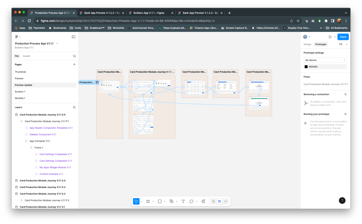
The prototype was delivered on time to be able to show features of the product to Leadership, Product Owners and Developers to base their aplication from and ironing some complex features.

Prototype

Project Disclaimer

The screens used on this Case Study are variants not used on the actual prototype due to NDA agreements and Copyright, the Design System Library and the Screens are based on a generic Bootstrap Library that mirror some of the functionalities of the actual delivered prototype but not all of them, and most features are obscured and modified on purpose to reflect features used on the Case Study.

© Copyright 2024 - Jose Eduardo Arredondo Delgado - All Rights Reserved