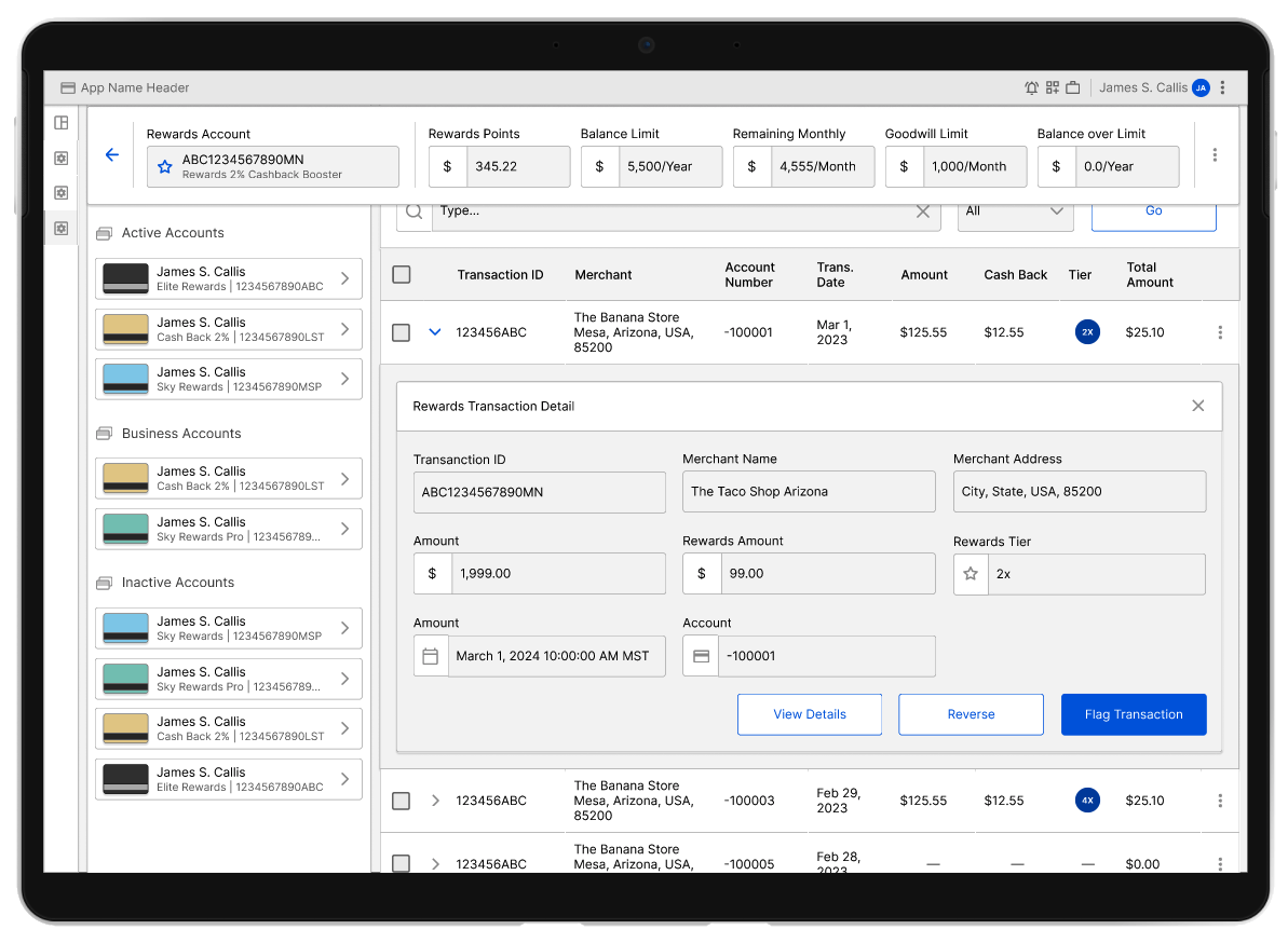
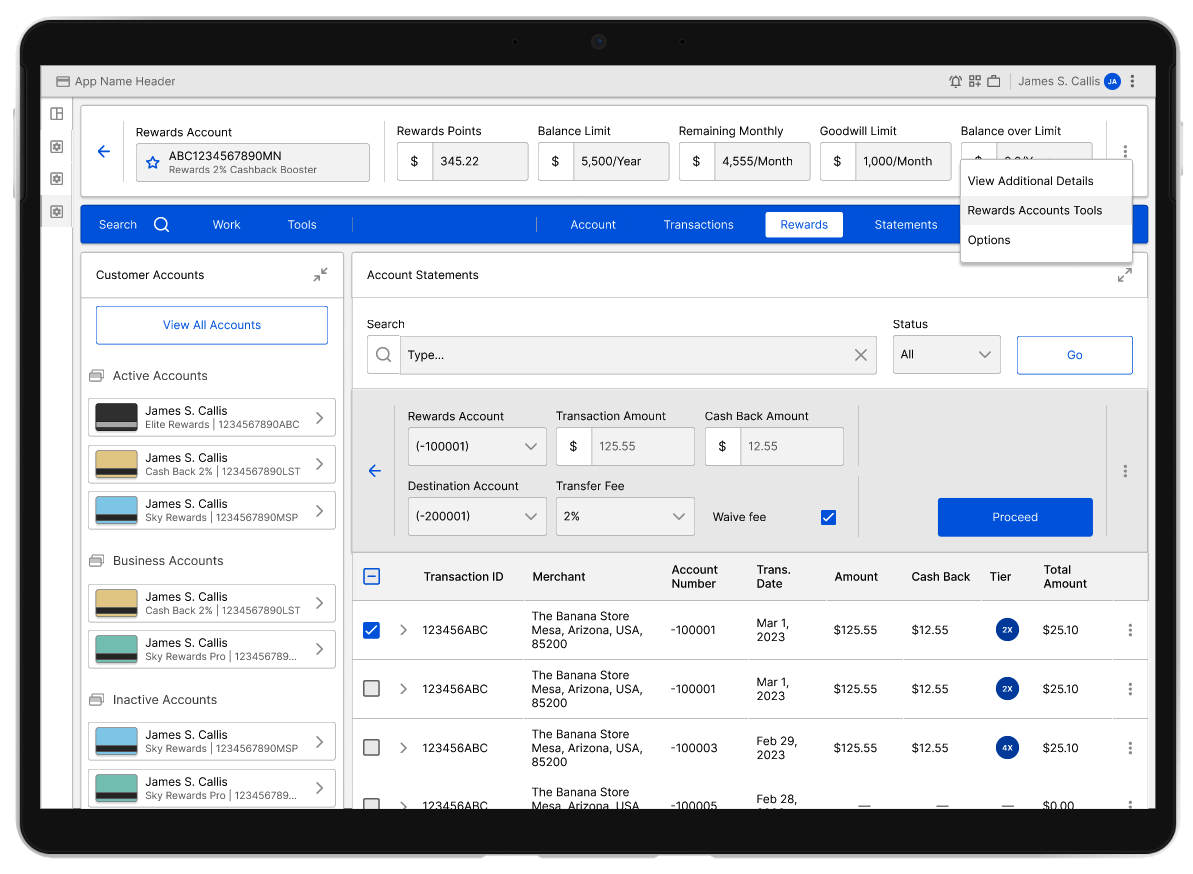
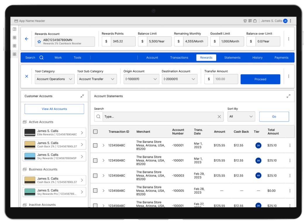
Collaborated with the Rewards Program team of a Global Banking Institution to migrate their existing customer support tools to a new platform. My role involved creating detailed prototypes, user journeys, and mapping user personas and flows. By utilizing user data, we enhanced the overall experience and efficiency to deliver the right solution.
Given the scope of the project and the numerous user journeys required, we worked closely with multiple Product Owners and development teams across different locations. This collaborative effort, which spanned several months, ensured that the unique needs of each journey were addressed. Despite the complexity, we successfully delivered the project on time, receiving praise from leadership for our efforts.
The process included a detailed analysis of the existing applications, translating their functionality into the new framework, and maintaining regular communication with managers and Product Owners to align with business goals. By leveraging high-quality user data, we improved over 50 distinct user journeys, equipping frontline colleagues with the tools they needed to better support the company’s customers.
Global Finance Instituion,
Phoenix, AZ
Apr 2023 to Jul 2024
Competitive analysis
User-interface design
Wireframing
Designing for Desktop
Developer collaboration
Team Wide collaborative effort
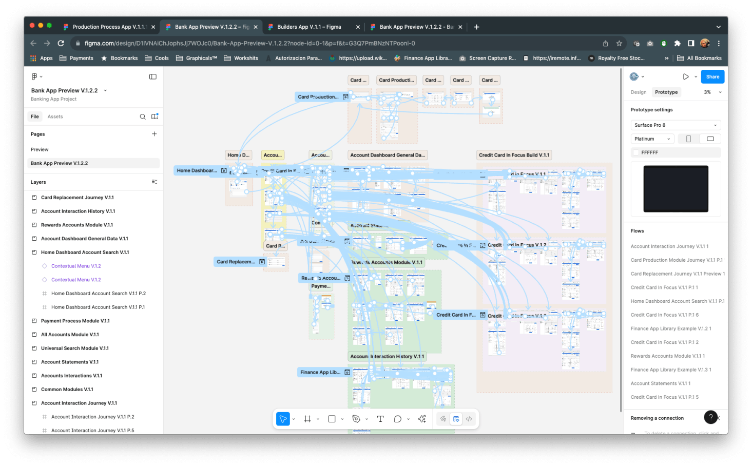
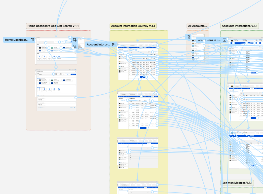
A fully-detailed journey map
Wireframes
User-interface designs
High-fidelity prototype
Working hand by hand with all parties involved we delivered a polished prototype, a detailed, full scope prototype that can be used as reference for development and leadership approval.
The client had a clear understanding of their needs, but the sheer volume of user journeys and dedicated applications was immense. With a tight budget and limited time, we had to optimize our workflow to manage the scope effectively. We were tasked with minimizing custom solutions and maximizing reuse of existing components from a pre-developed React library, which presented its own set of challenges.
The client required the dashboard and related applications to be ready for deployment in record time, as the existing tools were being phased out due to significant security and usability issues. These tools were over 30 years old, and an urgent upgrade was necessary to meet the evolving needs of the business and ensure effective service to external customers in a highly competitive environment.
From the outset, it was crucial to thoroughly understand every component of the system and how they interacted to provide data to the Customer Service Team. To achieve this, we created detailed maps and user journeys that covered all aspects of the project, from individual journeys to the entire application, while ensuring system consistency at every level.
The challenge was to develop a comprehensive suite of tools that met customer needs in a highly demanding business environment. Our goal was to deliver a top-tier experience that fully addressed client expectations. Customers of this banking institution expected exceptional service, consistent with the brand’s other offerings, making it critical to design a tool that could uphold the same high standards.
...the pace in which you have delivered UX for our project has been amazing!!...
In collaboration with the client, we dedicated a significant amount of time iterating on the journey map. Building a solid journey foundation was crucial before even considering the layout.
This map became an essential tool throughout the project, guiding discussions, supporting developers, and serving as a springboard for quickly producing the final wireframes. We created the map through a combination of live sessions and remote calls, ensuring a collaborative and efficient process.
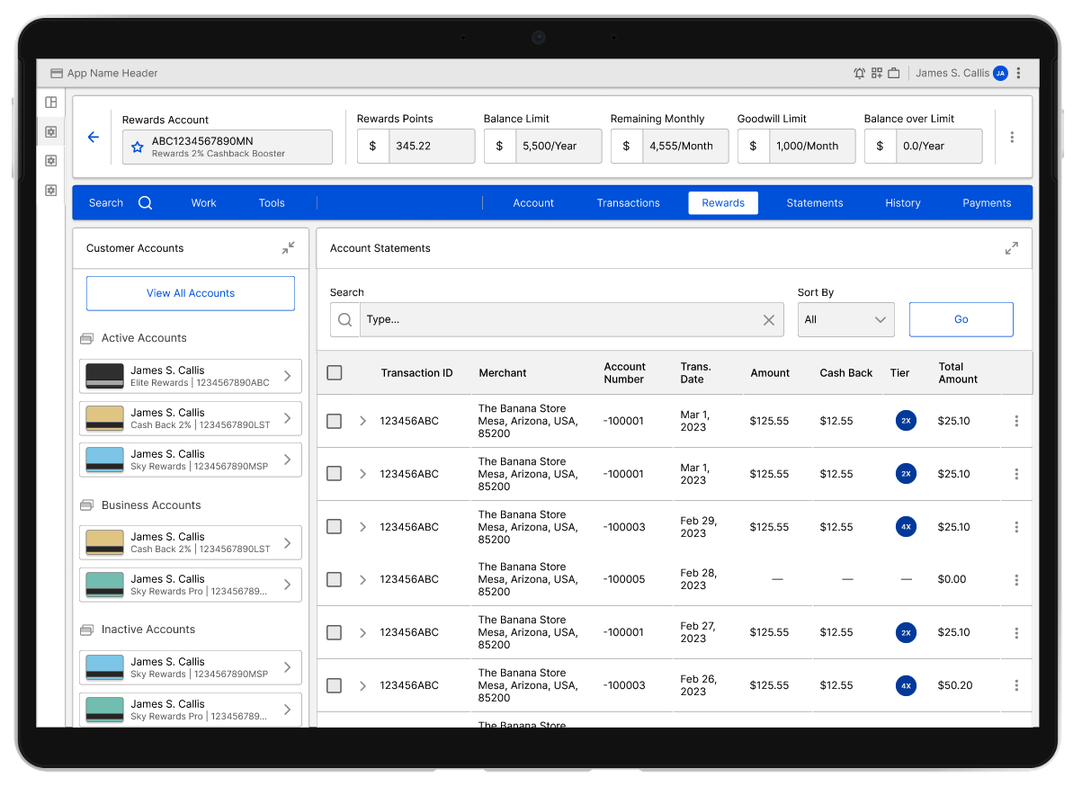
We ensured each screen provided the right amount of data, tailoring features based on user feedback. This allowed us to map out the precise features needed for each scenario, enabling the Support Team to access the necessary information efficiently, serve each user account promptly, and deliver the expected results. This effort addressed a long-standing pain point, which the client highly praised.
The dashboard we delivered now supports millions of customers every day.
The prototypes we delivered served as both documentation and a reference for the development team, providing detailed user journeys that covered all possible scenarios. The manager's requirements demanded the creation of multiple detailed wireframes, which helped build the Figma prototypes used as a reference for each feature.
The key to success was maintaining close communication with each team, ensuring that all features were considered and any limitations addressed before final delivery.
One of the project principles was to be lean. To produce just enough of a designed project to prove a theory. The prototype served two purposes: one to support the developers, and two to act as a fall-back to demo to Leadership and reference files for developers.
Not forgetting about the sad paths, we give these just as much attention. Users don’t know they’re taking a path you didn’t want them to, so the design quality can’t taper. Working iteratively and simplifying the design allowed us to achieve these goals.
The prototype was delivered on time, allowing Leadership, Product Owners, and Developers to review the product's features as a foundation for their application and to address some complex functionalities. The entire process took over a year, and the outcome was met with high praise from leadership, ultimately receiving recognition from the company for significantly enhancing system performance and efficiency, with this app playing an integral role in the broader Customer Support Improvement Program.