The Builder App
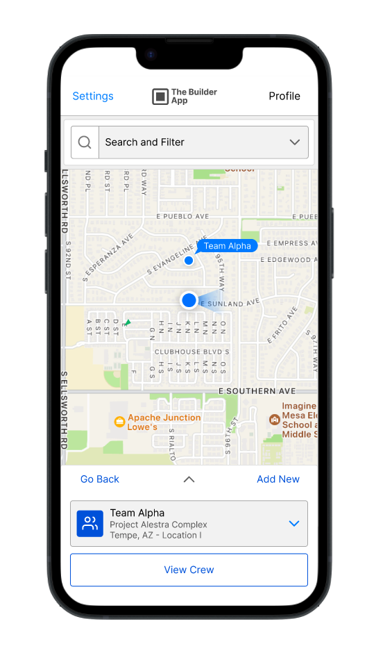
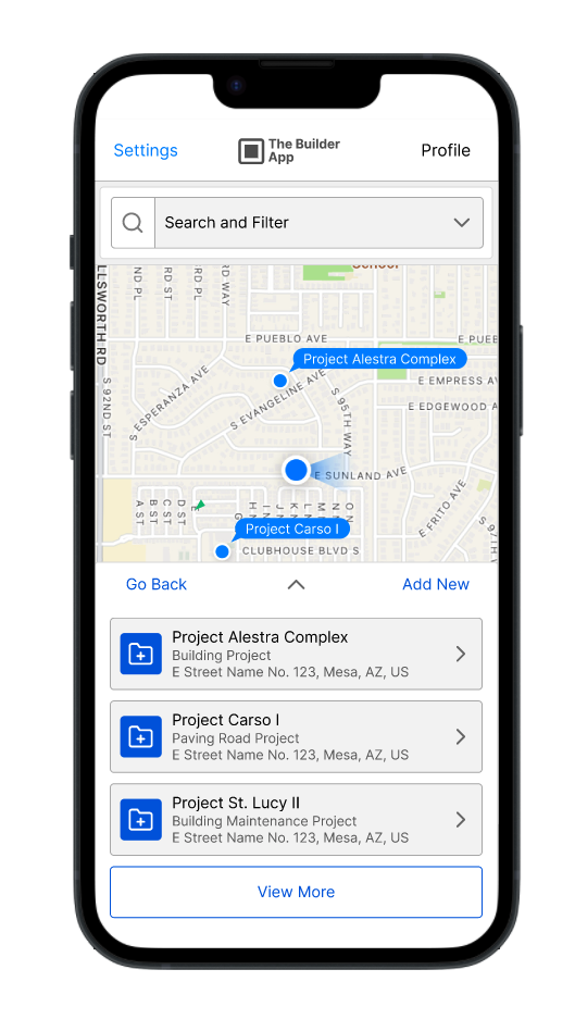
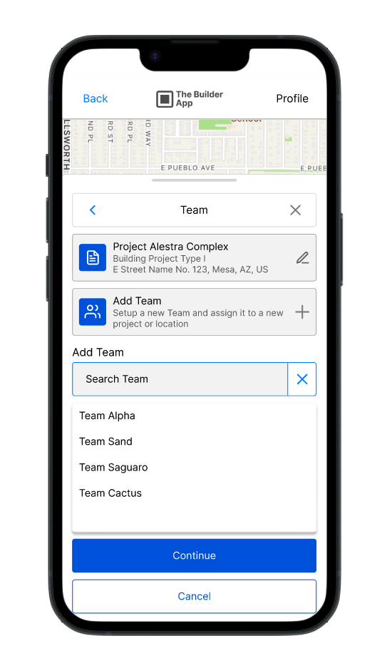
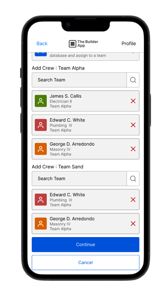
Our client's existing SaaS offering helps small constructors and contractors manage field human resources and hardware. Despite launching mobile (iOS/Android) and desktop administration tools, their initial market uptake was limited. They're now looking for a comprehensive overhaul of both web and mobile applications to significantly boost market share.
The primary need is for a user-friendly tool that allows field workers to effortlessly log their daily operations. This real-time data is crucial for managers to monitor resource location, task status, and time expenditure, ultimately enabling optimized resource deployment across construction sites via a single, intuitive interface.
To attract a wider client base, including larger enterprises, the client needs a modernized design and a superior user experience. This enhancement is vital for competitive differentiation and expanding their reach within the construction market.
Client and Location
Potential Customer Draft,
Houston, TX
Jan 2017 to Jun 2017


