I love to help teams to deliver products and services that help to make
lives easier and work more meaningful, so i always give my best to provide
the best solutions based on user research and business needs.
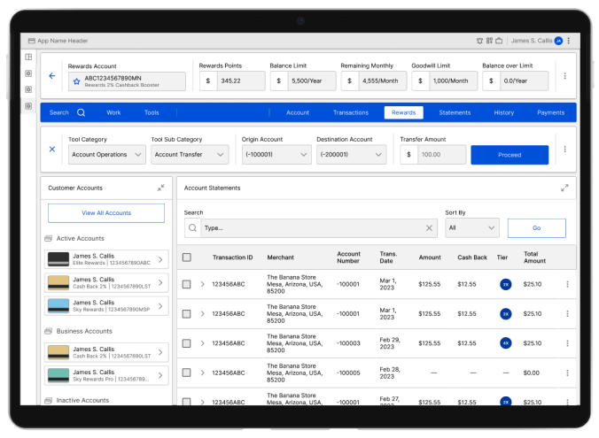
A Cardmember Rewards Program Support Tool redesigned to adapt to the ever changing realities of the market.
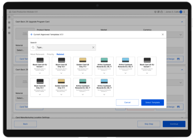
For a large financial institution, the card replacement process is a huge part of their daily operations and having the best set of tools to make sure every step of the card manufacturing process is being done properly is essential.
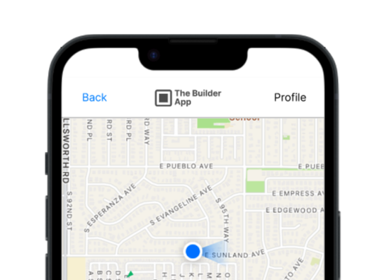
A Client with a limited budget and a brilliant idea for a SaaS Business Platform that need a revamp from its mobil App.
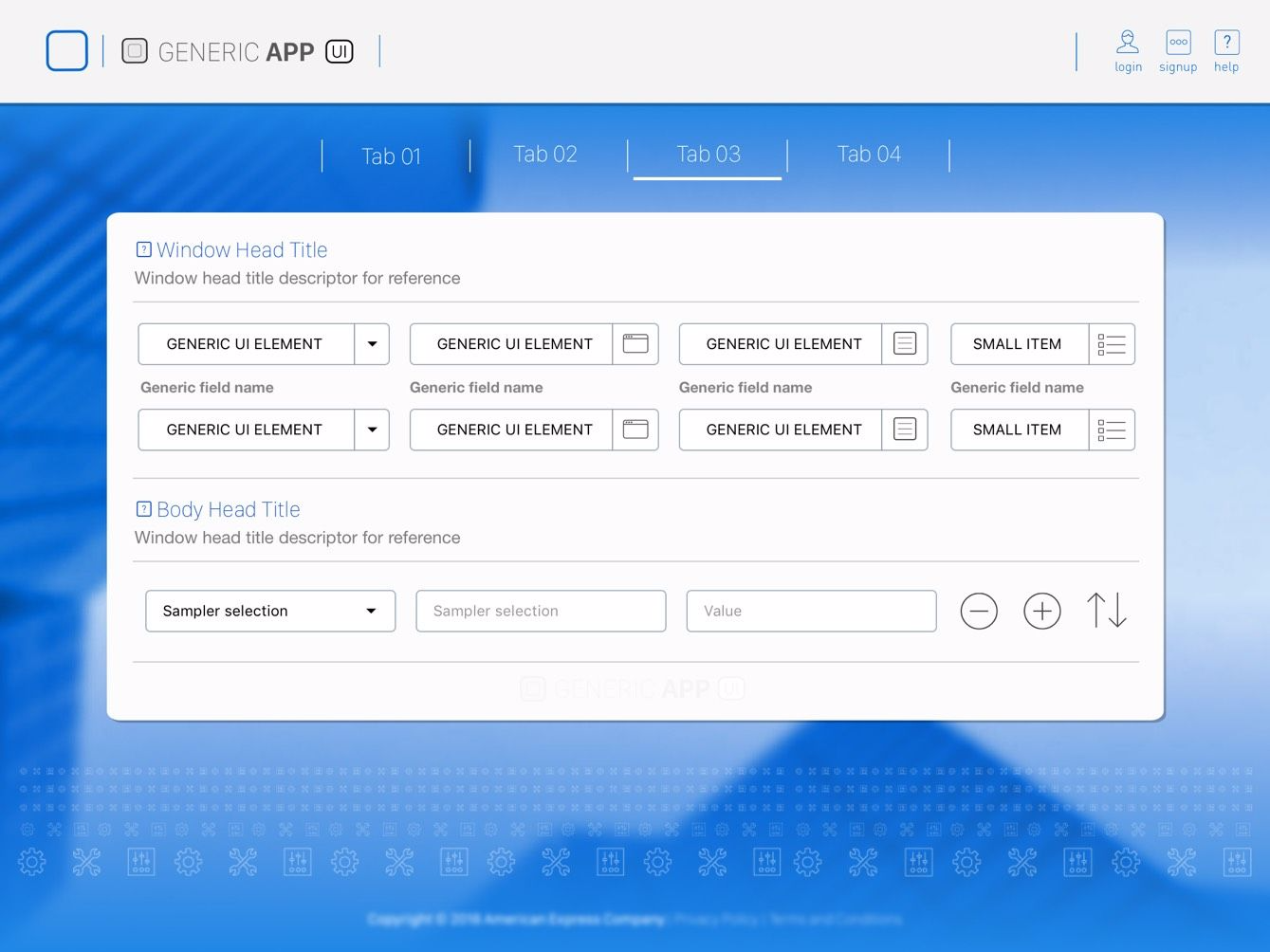
An Aplication to handle a simulated scenarios for server testing and to handle user preferences in promotion matching and delivery.
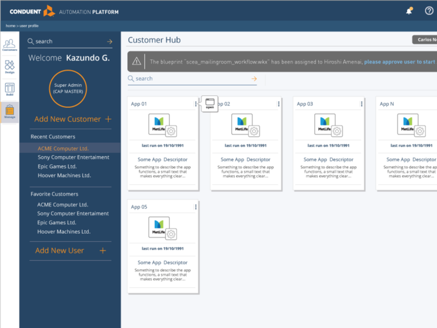
A white box product meant for the Insurance Claim Process Industry that will be released as a SaaS Software for this very competitive market.
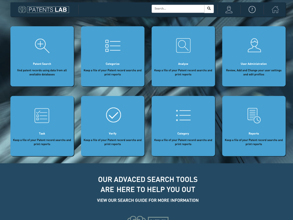
This application will connect and search popular patent databases, offering the user the ability to search in multiple databases in a single application, instead of have to look for each one individually.
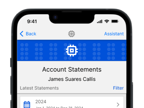
This example was to create a better version of an existing banking app, thru modifying the visuals without heavily modifying the internals of an already existing banking app.
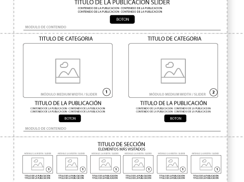
A newspaper website that was in the verge of losing its relevance in a very dificult market full of challenges that was in need of news to navigate violence and a complex politic enviroment.
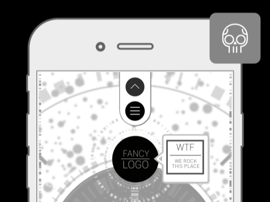
In my time as interactive designer, overflown screens with elements in motion (early to late 2000s) was the way to attract audiences, with fancy Flash sites and barroque designs.
A UX Experiment without any goal, other that use the phone acelerometers as a way to interact the UI.
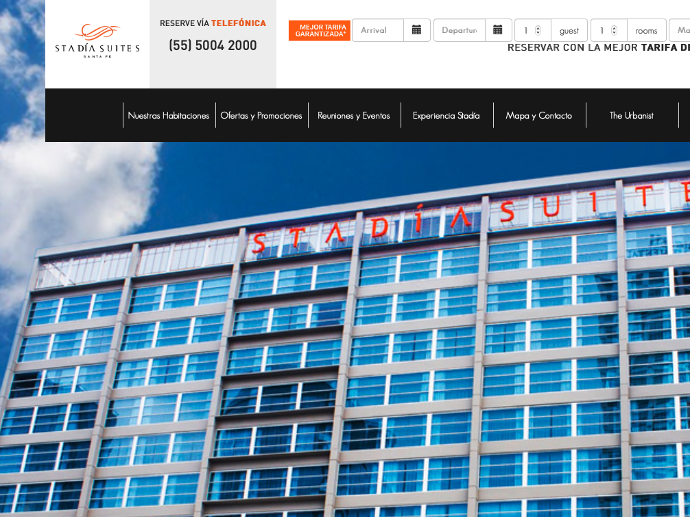
In 2018, working for a performance agency we helped to create a prototype for this boutique hotel located in CDMX.
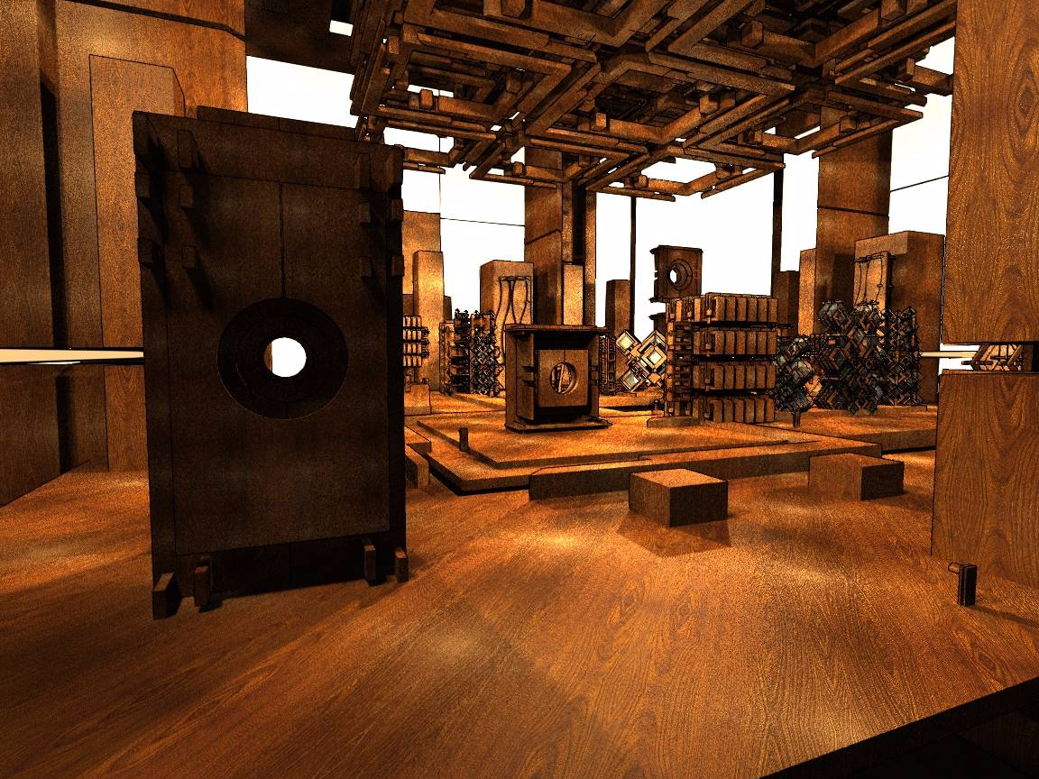
Just an space draft of a place were the wood and the light play together to create an motion that expands over time.